If a picture is worth 1,000 words
Let’s see the stories behind these
[CLICK ON COVER ART FOR MUSIC LINKS]

This picture was actually taken outside of Cez’s house. There were a few photos we took but there was only one that had everything blacked out around us. We knew that was the one. Cez recommended adding colour via the words. I didn’t know how to execute that without it looking cheesey, then I found this graffiti-esque font and knew what had to be done. I made each letter a different colour and intentionally made them out of line to give it that street art vibe.

I like to have my cover art reflect the song one way or another. I say “Walking through the city…”, and I just knew I needed the cover to connect to that (and this was my 1st single for my 1st official project so I had to do it for the city). I wanted to have an undeniably recognizable landmark from the city on the cover so I figured why not City Hall. Munira shot and edited the cover and the rest was history.

There was a time where I was binge watching “Rick and Morty” and it reminded me of the relationship I have with Cez. Given the different backgrounds we come from, he showed me a side of the city I haven’t seen before. In saying that, I sent a reference picture with my ideas to a graphic designer. Next thing I know, I had a humorously accurate depiction of the correlation between Rick and Morty and us.

I am Black & Puerto Rican and I wanted the cover art for B.A.R.F. (Black-A-Rican Flow) to reflect that. Since the record is bar driven, I didn’t want the cover to be too busy/complicated. I wanted both the Puerto Rican and the Pan African flags with nothing else but the song title, so I sent the idea to a friend. I love the power of simplicity.

Every October, there’s a challenge for artists that sketch, paint, etc. and I can’t really draw so I tested my pen in a different way. There’s a word prompt for each day of the month and I used those words to put this record together. I knew I wanted the words on the cover. That way, people would be able to follow along to see how/when I’ll use the words. Since October is the month of Halloween, I knew I also wanted the orange/black colour scheme and a Jack-O-Lantern on the cover. I felt that it was still missing something so I added some embers and it definitely livened it up.

All I knew when brainstorming was that this cover had to have some type of foreboding feel to it. I found a picture that Munira took of me sitting and looking serious. I edited everything around me out, however, the edits weren’t clean and my clothes were too bright to convey the feeling I was aiming for. I added clouds so that way it seems like I’m sitting on one and losing any sense of being grounded (and i blended the “parental advisory” sign in the clouds to emphasize on that feeling of being in the clouds). I wanted you to see me, but not focus on what I looked like, just on what I’m saying. That’s why my face is scribbled out and the title of the song is behind me. Last but definitely not least, I put a filter that made the clouds appear like storm clouds and grayed out my clothes to fit the tone.

Another one of Munira’s work. When discussing what the cover would be, I always wanted this picture to be it. I felt as though it represented who and where I was at the time. The warm, dark background contrasted by my white shirt and colourful socks gave off a feeling of hope, the light at the end of a dark tunnel kind of thing. Mu worked her editing magic to really bring the colours out and Cez always said that my music is timeless so I asked her to make the cover look worn out like an old photo. She did exactly that and it really completed the theme and feel that the album had; A person going through everyday situations, putting on a “face” and internally, going through a power struggle with oneself. Looking for the answer and ended up being the answer all along.

Every time I hear the “Yikes” instrumental, I always see red. In saying that, I knew the cover had to have red in it somehow, someway. I love hip hop and I acknowledge it’s more than just rap, it’s a lifestyle. Graffiti was and is an integral part of the culture so I decided to have a canvas with graffiti and slap a red filter on it. Cez is a firm believer of having powerful statements attached to a face so he recommended I find a way to incorporate that. I blended a blurry picture of me in the background cause I didn’t want to over shadow the initial feeling I was going for and I liked how abstract it looked.

I knew I needed to have asphalt and no concrete on the cover. After all, the record is about how the streets have no boundaries. I included my son to emphasis how the youth is in the center of “hood politics”. We must teach our children the harsh realities in order to prepare them for the world. So I sat him in front of a blank wall, sent the picture to a friend, told her I wanted “No Sidewalks” written in graffiti and she did just that. I chose graffiti due to the fact it's a staple in hip-hop culture. I really wanted to combine all the elements of the record and message into one powerful piece.
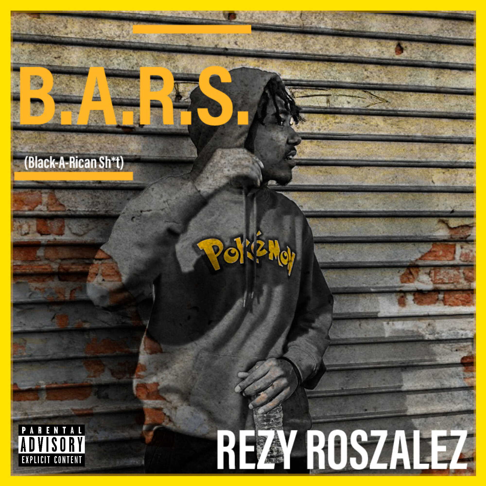

I wrote and recorded this record back in 2018. Cez originally wanted it be on “Patience”, however, it didn’t really fit. Fast forward to everything happening in 2020, I couldn’t stay silent and I felt like I could add to the current conversations. A friend of mine took some photos of the protests that took place downtown in Philadelphia. I seen them and automatically knew that if I were to do this right, I needed to have what was happening to be what people saw as they go to listen to the record.
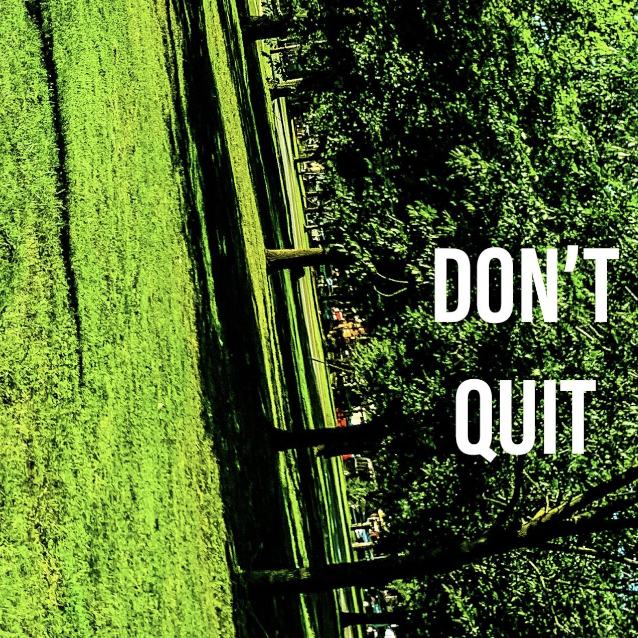
You know that feeling when things change and it’s as if the world kinda flipped on its side ? When everything is nothing more than a shadow of what it once was. Well that’s the feeling I was aiming to convey. That’s why the picture is sideways and there’s a lot of shade/shadows. Why a park you may ask, it’s because she loves nature.

This was actually my second attempt at a cover for the project. Since I love coffee and the project is inspired by that love, I wanted a cup of coffee on the cover. In saying that, I ordered a coffee just to have a photoshoot in the store. I had to, between the coffee and the wall/table, the colours were just so complimentary. Aesthetics are everything.
FUN FACT: This project is a spiritual successor to an old project of mine, Coffee Nights (2016).

I wanted to connect this song to the original. Back in July 2019, I filmed the visualizer for “B.A.R.F.” (the 2nd single off of my 1st album, Patience). I found a picture that was taken that day and thought, “With the right editing, that’d be a hard cover !” I love how it incorporated those who’ve been supporting me for years and how it resembled the iconic “Golden Eye” scene and how I was the only one with a trace of blue on them. The rest is history.
FUN FACT: I didn’t even realize at the time that both B.A.R.F. records are the only ones with mostly white cover arts.

Since October is the month of Halloween, I love connecting the Inktober visual(s) to that vibe. I kept the orange/black colour scheme. Since I incorporated a jack-o-lantern last year, I wanted to do something different this year. I was gonna make the cover art have a cool pic of me with the words jumbled at the bottom. Unfortunately, the idea wasn’t really translating well when I attempted to execute. Then BOOM ! An epiphany occurred, “What if I made a crossword puzzle outta the words !?” And that’s exactly what I did.

So Sunshine is a painter as well as a singer-songwriter. She had a canvas that had a hand coming from the sky, reaching down towards a body of water. I told her that’s a dope piece, you should do something like that for the cover. She booted up Photoshop and created this (with minor changes to fit the vibe of the record). All I did was add the parental advisory sign and that red smoke-like colour for flavor.

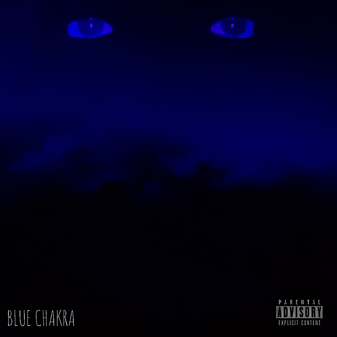
This song was originally intended to be a secret outro to “Patience” (in order to lead into my next album). Because of that, I didn’t really have a title for the record and after a year and some change, I still didn’t have a title for the record. In saying that, I knew I wanted disembodied eyes (those are mine). I was struggling to execute my initial idea for the cover though. I kept the eyes there and played around with the picture, then I landed on this design. I liked how it looked like smoke (and how it appeared as a mouth). From there, I smoothened/softened the art to make it look more painting-esque. I then played around with filters till I found this beautifully deep blue. I loved how the filter changed the whole vibe of the picture, making it look like my eyes were above some very dark clouds (representing how I overcame being in a dark place). So now I had the cover done but still no title! I like having the art encapsulate the entirety of a record (title, sonics, content, etc.). Anyway, I’m learning about chakras and realized that the blue chakra is your throat chakra (which is most commonly associated with honesty, communication, etc.). I felt like the song perfectly fit that theme and thus the title was born. Long story short, the chicken came before the egg.

I actually took this photo back in 2015. When brainstorming for cover art, I stumbled across this pic in my phone. I loved how grimy and real it looked. However, the OG pic felt too cold for the album, so I had to change the colour to add a warm feel to it. I wanted this project to come off as inviting while still keeping the honest and not so inviting aspects. That’s what makes it feel real to me. Ironically enough, I added some grain to give it a painting/cinematic poster look to it. I approached this album with the same energy as if I was creating a movie. That’s how serious I took the story I was aiming to tell. Between the colourful houses, the fire/smoke, the fire dept. & the beautifully coloured sky, this picture exemplifies how lovely but dangerous my neighborhood can be. On one hand, you have a vibrant, loving community. But on the other, you have a neighborhood burning down, needing help to put out the fire that threatens all life here. But what do you do when what’s killing you, is the very thing that keeps you alive ?
FUN FACT: A version of this picture was used back in 2016 for the cover of my “THat Part Freestyle’ but it’s been taken down for years and since barely anybody got to see it, I had to bring new life in that/this amazing picture
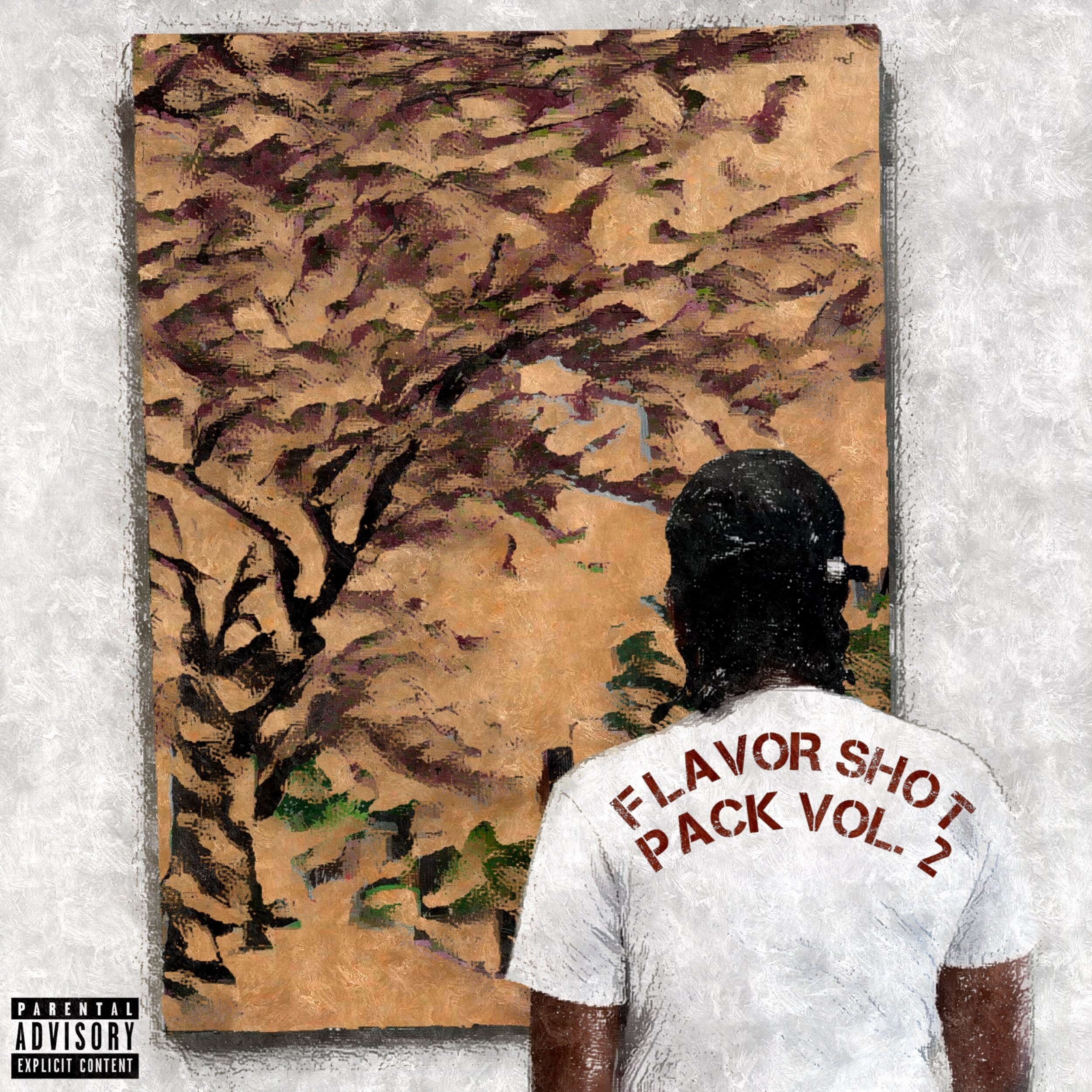
I’ve been wanting to take my music in a more artful direction rather than just be hot over dope beats. This projects paints a picture of how I feel in ways I haven’t done before. I wanted to show that on the cover. The white wall represents a clean slate and I’m just there looking at the art I created (both figuratively and literally lol). I didn’t wanna show my face because I didn’t want it to be like I’m directing my words at you, the listeners. I wanted it to feel like you’re standing there with me, looking at the art in unison, which in turn makes the music less about me rapping and more of us having a conversation together.
FUN FACT: I wanted to convey the feeling of being in a café musically speaking. And i ended up taking this picture in a Starbucks. I changed the picture I’m looking at to something that was an easter egg of sorts for what’s to come.

Since the “Black Girl Gone Soundtrack” focuses on appreciating and caring for black women, I knew I needed a piece as powerful as the musical intent. I found a picture of my 2nd born holding his mom’s hand and dressed it up so the main focus is the connection between mother and child. Added the lighting effect to emphasize the heavenly feeling that those in a maternal positions are able to give to their loved ones. As black men, most of us come from black women, however, although I didn’t, my children did and I just wanted to share my view on how beautiful it is to see, even if it’s not something you’ve experienced personally.

Since coke (cocaine) is often associated with snow imagery, I wanted to capture that aspect of the original song as a homage so to speak. I also love how the scenery is cold and bare, emphasizing the raw, poignant delivery that’s present in the freestyle. Lastly, the vignette represents my “tunnel vision” and the reason it’s dark is to reflect the space I was in that resulted in this record (which is represented in the outfit worn in video, click here to see).
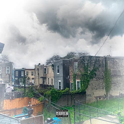
I wanted this freestyle to continue the theme of having the scenery represent the space I’m in. If you noticed, this cover is the same location and angle as the “Diet Coke Freestyle”. Reason for that is I wanted to show how even with visual growth, I'm still in the same position with grey clouds looming over me. This time, the vignette is much lighter than last time, showing how I’m starting to clear the air and purify myself in the process (which is also represented in my outfit worn in the video, click here to see).

I’m sitting alone in a seemingly empty café, watching the world outside. The only thing separating me and the world is this place I’m in. This emphasizes the themes discussed on the project. I wanted to evoke the feelings of isolation, yearning for more and loneliness. It’s even alluded to with the framing of the picture. I’m on the bottom, representing how I’m feeling down, and above my head is the “active outside world”, representing how I constantly think and yearn to be free, be a part of something bigger and most importantly, wanting to not feel alone. No pun intended but outside all of that, I always wanted a cover that has me staring out the window of a diner/café, and given this project is inspired by coffee, I chose the latter.


![Patience [Album]](https://images.squarespace-cdn.com/content/v1/5e691b9fad9b427b61295ae9/1584030417874-TUREMHIO97RTGOEIVLRI/Patience.JPG)


